
 0
0
 0
0
React dashboards often begin with simple charts, but the requirements rarely stay simple for long. Filters, live data, zooming, tooltips, custom states, and multiple visualization types quickly turn charting into a bigger technical decision. The library affects interface speed, code maintainability, and the way users interact with data. Some options are better for lightweight UI components, while others are built for larger datasets and more demanding dashboards.
This list compares React chart libraries by integration quality, rendering speed, chart variety, customization, documentation, and production readiness.
1. SciChart
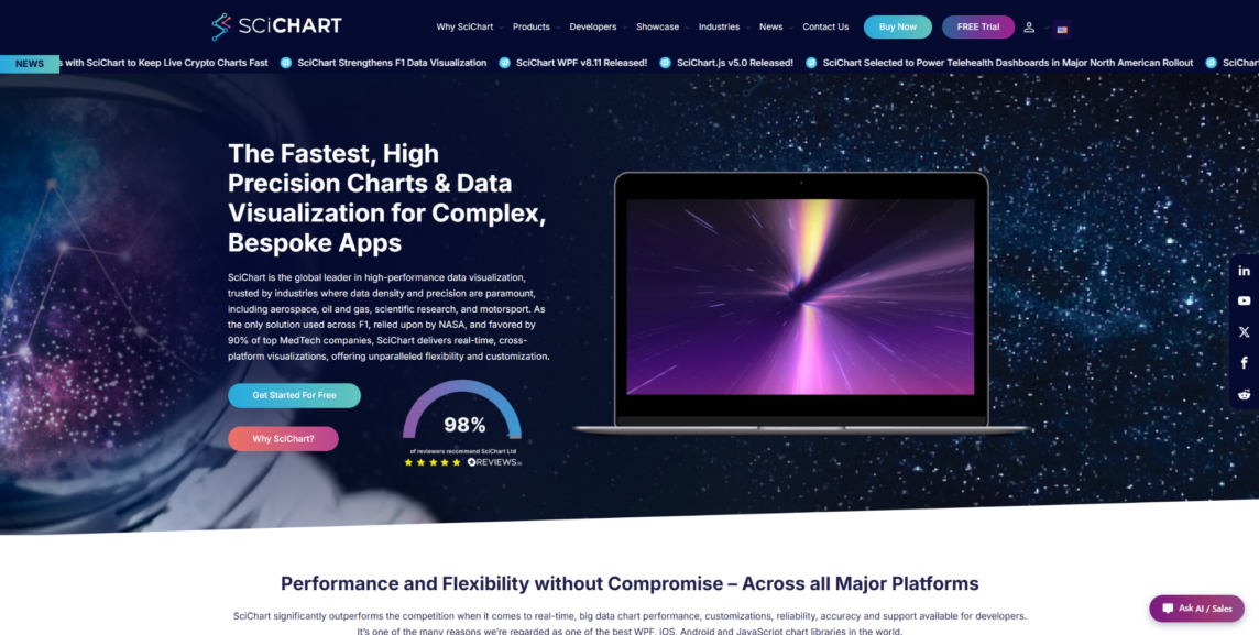
SciChart is built for React products where charts need to handle large data volumes, live updates, zooming, panning, annotations, and complex interaction. The SciChart React chart library is a strong option for trading platforms, medical interfaces, engineering tools, monitoring dashboards, and scientific applications. It is not a universal pick for every project. SciChart makes the most sense when charting is a central product feature, not a minor dashboard element. Since it is a premium commercial tool, smaller dashboards with basic charts may not need this level of depth.
SciChart’s main value is the way it keeps charts responsive under load. It supports 2D charts, 3D charts, heatmaps, gauges, polar charts, and detailed customization. That range matters when a product needs more than a few standard dashboard visuals. The library is especially relevant when chart performance directly shapes the user experience:
- Handles large datasets and frequent updates in React-based applications;
- Supports advanced visuals such as 2D charts, 3D charts, heatmaps, gauges, and polar charts;
- Gives developers control over annotations, interactions, styling, and chart behavior;
- Provides examples, demos, documentation, and support for implementation work;
- Suits commercial products where chart speed affects the user experience.
SciChart is not the right choice for every MVP or small admin dashboard. Its advantage becomes clear when data volume is high, charts update frequently, and users interact with visualizations directly. For this list, it takes first place because large React dashboards often run into rendering limits before the rest of the interface becomes a problem.
Where It Makes Sense
SciChart fits engineering teams, product teams, and software companies building chart-heavy React products. It is most relevant when lag, limited chart types, or weak interaction would hurt the product experience.
2. Recharts
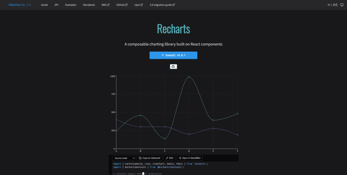
Recharts is one of the most familiar choices for React teams that want clean charts without complex setup. Its component-based approach feels natural in React projects and keeps the chart code easy to read. Many teams use it for SaaS dashboards, internal tools, admin panels, and basic analytics pages. It is not built for very complex visualization or heavy real-time data. Its main appeal is simplicity, clarity, and fast implementation.
Recharts is a good match for typical dashboard screens where development speed matters. It gives developers chart control through React components without forcing them into low-level rendering work. That makes it easier to ship standard reporting views and product dashboards. The library stands out for practical, everyday React charting needs:
- Uses a component-based API that feels natural in React projects;
- Covers common chart types for dashboards, reports, and analytics pages;
- Helps developers build readable chart code without a heavy setup process;
- Handles static and moderately interactive business dashboards;
- Has broad adoption and many examples from the React community.
Recharts is strongest in ordinary product interfaces. It can become limiting when a project needs advanced interactions, unusual visuals, or serious rendering performance. For many React teams, though, the simple API and quick integration are exactly the point.
Good Match For
Recharts suits SaaS dashboards, internal tools, admin panels, and early-stage products with standard charting needs. It is less convincing for scientific, financial, or real-time products with heavy data loads.
3. Nivo
Nivo is a React visualization library for teams that want polished charts without spending too much time on design. It fits product dashboards, reporting pages, data storytelling, and interfaces where visual quality matters. Compared with simpler React chart libraries, it offers a wider set of chart types and presentation options. It should not be treated as a replacement for specialized high-performance rendering. Nivo is strongest when the goal is a clean balance between visual quality, ready-made components, and smooth integration.
Nivo helps teams build attractive dashboards quickly. It includes responsive charts, themes, tooltips, legends, and animation, which reduces the amount of design work needed upfront. That makes it useful for products where charts must look clean in customer-facing interfaces. Its main strengths are tied to presentation, chart variety, and developer convenience:
- Offers polished chart components that look clean with minimal design work;
- Includes many chart types for dashboards, reports, and data presentation pages;
- Provides theming options, legends, tooltips, and responsive behavior;
- Helps React teams create attractive visuals without building charts from scratch;
- Fits products where presentation quality matters as much as chart coverage.
Nivo is a solid pick when charts need to look good out of the box. For very large datasets or live rendering, it should be tested carefully with real project data. It works best when design quality and development speed matter more than specialized rendering power.
Ideal Use Cases
Nivo suits polished dashboards, customer-facing analytics, reports, and content-style data pages. For heavy real-time dashboards, teams should test performance early or compare it with more specialized tools.
4. Visx
Visx is not the library to choose when you want a ready-made chart component in five minutes. It provides low-level building blocks for custom visualizations in React. This makes it useful for product teams with strong front-end skills and specific design requirements. It is not the easiest option for beginners or teams that want quick dashboard assembly. Visx becomes valuable when ready-made chart libraries feel too restrictive.
Visx gives developers more freedom, but that freedom comes with more work. It suits custom dashboards, branded analytics, and visual systems that need tight control over layout and interaction. Instead of locking the team into a fixed chart component model, it lets developers shape the chart architecture themselves. That makes it appealing for projects where the visual layer needs to be highly specific:
- Gives developers low-level building blocks for custom React visualizations;
- Allows tighter control over layout, styling, scales, shapes, and interactions;
- Fits products where charts must follow a specific design system;
- Avoids locking teams into a rigid chart component model;
- Works best when the front-end team is comfortable building chart logic manually.
Visx can be valuable for custom products, but it does not remove the hard parts of chart development. The team still needs to plan the chart structure, interaction behavior, and testing. It is worth considering when design control matters more than a quick start.
Best Suited To
Visx suits experienced front-end teams, design-heavy products, and companies building custom analytics interfaces. It is less convenient for teams that need a simple dashboard library with ready-made charts.
5. Victory
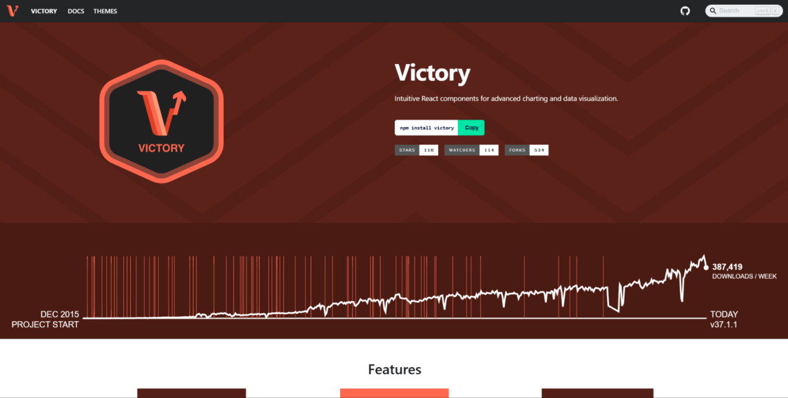
Victory gives React teams a stable component-based approach with a clear chart code structure. It is often considered for dashboards, reports, prototypes, educational tools, and apps with standard visualization needs. It may not look as modern as some newer libraries, but predictability still has value in real projects. It is not the strongest option for heavy rendering or advanced real-time interaction. Victory’s main strength is the clean organization of reusable chart components.
Victory is useful when a team wants a logical React API and a dependable set of basic charts. Its value comes from stability, consistency, and component reuse. The library can support common charting needs without a complex rendering setup. That makes it relevant for teams that care more about maintainable chart code than advanced visual depth:
- Provides reusable React components for common charting needs;
- Supports standard charts used in reports, dashboards, and product interfaces;
- Offers a predictable API that can be easier to maintain across a codebase;
- Helps teams build consistent visuals without a complex rendering setup;
- Can support projects that need charting patterns across the web and related interfaces.
Victory handles standard tasks well, but it is not the best option for heavy datasets or complex live interactions. It works better when the team needs a simple structure and does not require a large catalog of advanced visuals. For straightforward charting in React, it remains a practical option.
Useful For
Victory suits reports, simple dashboards, prototypes, and education-focused interfaces. It is less suitable for trading platforms, scientific tools, or products with heavy rendering demands.
6. Tremor
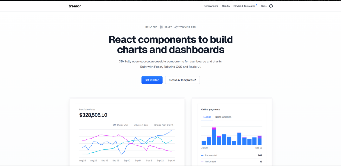
Tremor is not a pure charting library. It is a dashboard-focused React UI toolkit with components for cards, metrics, charts, and layouts. This makes it useful for teams that want to build clean dashboard pages quickly. Its focus is fast interface assembly rather than deep chart engineering. Tremor is better for MVPs, internal dashboards, and simple analytics screens than for heavy visualization products.
Tremor brings value when charts are only one part of a broader dashboard interface. The library helps teams assemble analytics pages without designing every UI block manually. It can reduce setup time when the goal is to create a tidy, functional dashboard quickly. Its strengths are tied to delivery speed and a ready-made interface structure:
- Provides ready-made components for dashboard layouts, metrics, and charts;
- Helps teams create clean analytics pages without designing every UI block manually;
- Fits internal tools, MVP dashboards, and lightweight reporting screens;
- Reduces setup time when charts are part of a broader dashboard interface;
- Suits teams that value speed of delivery over deep chart-level control.
Tremor is helpful when the main goal is to ship a clean dashboard quickly. For complex custom visualization, large datasets, or advanced chart interactions, it can feel limited. It should be treated as a dashboard UI shortcut, not as a specialized charting engine.
Works Best For
Tremor suits startups, internal tools, admin panels, and MVP dashboards where speed matters more than deep chart control. For data-heavy products, teams should look at libraries built around rendering, interaction, and scale.
Final Thoughts
React chart libraries are built for different levels of complexity. SciChart fits heavier React apps where charts work with large datasets, live updates, and detailed interaction. Recharts, Nivo, Visx, Victory, and Tremor cover other needs, from simple dashboard components to custom visual systems and fast UI setup. Popularity and polished demos are not enough to make the right choice. The best option depends on real data, interface requirements, team skills, and long-term maintenance needs.